Page 97 - The Language of Composition 4e Teacher Edition Sample.indd
P. 97
xtending
                       e
                                           the
                       extending beyond the text                                     4      CHECK FOR UNDERSTANDING          chapter 4
                                               te
                                                  xt
                                 beyond
                                                                                            o help students analyze the data, you
                                                                                            T
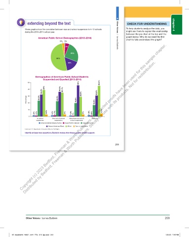
                     These graphs show the corr
                     These graphs show the correlation between race and school suspension in K-12 schools   To help students analyze the data, you
                                    elation between race and school suspension in K-12 schools
                                                                                            might ask them to explain the relationship
                   during the 2013–2014 school year.                                        might ask them to explain the r elationship
                                                                                            between the pie chart at the top and the
                                                                                            between the pie chart at the top and the
                                                                                            graph below. Why do we need the first
                            American Public School Demographics (2013–2014)                 graph below . Why do we need the first
                                                                                            chart to fully understand the graph?
                                                                                            chart to fully understand the graph?
                                            3%  1%
                Copyright (c) 2023 Bedford, Freeman & Worth Publishers. Uncorrected proofs have been used for this sample chapter.
                                                5%
                                                                                     Other Voices  /  James Baldwin
                                                    25%
                                         50%
                   Distributed by Bedford, Freeman & Worth Publishers. Strictly for use with its products. Not for redistribution.
                                                  16%
                          Demographics of American Public School Students
                                Suspended and Expelled (2013–2014)
                                                         46%            45.3%
                     50
                                 39%
                     40                     36.3%  35.1%
                               32.4%                       28.9%       30.9%
                    Percentage  30  23.3%  22.5%        19.8%        16.8%
                     20

                     10                                                   4.2%
                          1.3%  1.2%  2.8%  1.4%  1.7%  3%  1.3%  1%  3%  1.8%  0.9%
                      0
                           In-school   One out-of-school  More than one out-of-  Expulsion
                           suspension   suspension  school suspension
                              American Indian/Alaska Native   Asian/Paci c Islander   Hispanic/Latino
                                    African American/Black   White   Two or more races
                   Data from U.S. Department of Education Office for Civil Rights.
                   Data from U.S. Department of Education O ce for Civil Rights.
                       Identify at least two assertions Baldwin makes that these graphs would support.


                                                                                    203


         05_sheatlc4e_40925_ch04_170_315.indd   203                               12/10/22   2:34 PM


                    Other Voices / James Baldwin                                                                       203


          05_sheatlcte4e_46921_ch04_170a_315_2pp.indd   203                                                             1/20/23   7:45 PM

