Page 49 - 2024-bfw-starnes-TPS7e-SE proofs.indd
P. 49
36     UNIT 1  Exploring One-Variable Data


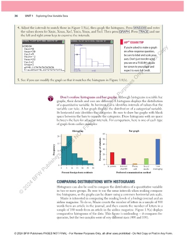
                 4. Adjust the intervals to match those in Figure 1.8(a), then graph the histogram. Press  WINDOW  and enter
                   the values shown for Xmin, Xmax, Xscl, Ymin, Ymax, and Yscl. Then press  GRAPH. Press  TRACE  and use
                   the left and right arrow keys to examine the intervals.

                                                                                         AP® EXAM TIP
                    NORMAL FLOAT AUTO REAL RADIAN MP  NORMAL FLOAT AUTO REAL RADIAN MP
                   © 2024 BFW Publishers PAGES NOT FINAL - For Review Purposes Only - Do Not Copy
                                                        Plot1:L1
                    WINDOW                                                               If you’re asked to make a graph
                     Xmin=0
                     Xmax=30                                                             on a free-response question,
                     Xscl=5                                                              be sure to label and scale your
                     Ymin= - 2
                     Ymax=22                                                             axes. Don’t just transfer what
                     Yscl=2                                                              you see on a TI-83/84 calcula-
                     Xres=1                                                              tor screen to your paper and
                     ^ X=0.11363636363636
                     TraceStep=0.227272727272...       min=0       n=13                  expect to earn full credit.
                                                       max<5
                 5. See if you can modify the graph so that it matches the histogram in Figure 1.8(b).


                                              Don’t confuse histograms and bar graphs. Although histograms resemble bar
                                      caution
                                            graphs, their details and uses are different. A histogram displays the distribution
                                            of a quantitative variable. Its horizontal axis identifies intervals of values that the
                                            variable can take. A bar graph displays the distribution of a categorical variable.
                                            Its horizontal axis identifies the categories. Be sure to draw bar graphs with blank
                                            space between the bars to separate the categories. Draw histograms with no space
                                            between the bars for adjacent intervals. For comparison, here is one of each type
                                            of graph from earlier examples:


                                                      Histogram                              Bar graph
                                                                           60
                                            20                             50

                                            15                             40
                                          Frequency  10                  Percentage of students  30


                                             5                             20
                                                                           10
                                             0                              0  In person  Internet  Phone  Social  Text
                                              0   5  10  15  20  25  30                chat/IM  call   media  messaging
                                               Percent foreign-born residents       Preferred communication method


                                            COMPARING DISTRIBUTIONS WITH HISTOGRAMS
                                            Histograms can also be used to compare the distribution of a quantitative variable
                                            in two or more groups. Be sure to use the same intervals when making compara-
                                            tive histograms, so the graphs can be drawn using a common horizontal axis scale.
                                              Mazie is interested in comparing the reading levels of a biology journal and an
                                            airline magazine. To do so, Mazie counts the number of letters in a sample of 400
                                            words from an article in the journal, and then counts the number of letters in a
                                            sample of 100 words from an article in the airline magazine. Figure 1.9(a) displays
                                            comparative histograms of the data. This figure is misleading — it compares fre-
                                            quencies, but the two samples were of very different sizes (400 and 100).


               © 2024 BFW Publishers PAGES NOT FINAL - For Review Purposes Only, all other uses prohibited - Do Not Copy or Post in Any Form.


          02_StarnesTPS7e_40934_un01_p1_001_086_6pp.indd   36                                                          13/09/23   5:37 PM

