Page 45 - 2024-bfw-starnes-TPS7e-SE proofs.indd
P. 45
32     UNIT 1  Exploring One-Variable Data


                                                Here is a stemplot of the percentage of residents aged 65 and older in the 50 U.S.
                                                states: 37

                                                              11  18
                                                              12 6
                   © 2024 BFW Publishers PAGES NOT FINAL - For Review Purposes Only - Do Not Copy
                                                              13  9
                                                              14  23
                                                              15  44445677889999
                                                              16  23444557999      Key: 19|3 means 19.3% of
                                                              17  0112225567       the state’s residents are
                                                              18  12477            aged 65 and older.
                                                              19  39
                                                              20  56

                                              2. The largest data value is for Maine. What percentage of Maine residents are 65
                                                or older? (Florida has the second largest data value.)
                                              3.  Make another stemplot of the data by splitting stems. What does this new graph
                                                reveal that is not apparent from the original stemplot?


                                            Displaying Quantitative Data: Histograms


                                            You can use a dotplot or a stemplot to display quantitative data. Both of these
                                            types of graphs show every individual data value. However, for large data sets, this
                                            can make it difficult to see the overall pattern in the graph. We often get a cleaner
                                            picture of the distribution by grouping nearby values together. Doing so allows us
                                            to make a new type of graph: a histogram.


                                             DEFINITION  Histogram
                                             A histogram shows each interval as a bar. The heights of the bars show the fre-
                                             quencies or relative frequencies of values in each interval.


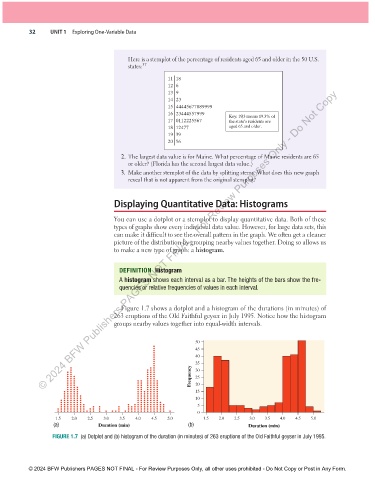
                                              Figure 1.7 shows a dotplot and a histogram of the durations (in minutes) of
                                            263 eruptions of the Old Faithful geyser in July 1995. Notice how the histogram
                                            groups nearby values together into equal-width intervals.


                                                                       50
                                                                       45
                                                                       40
                                                                       35
                                                                      Frequency  30
                                                                       25
                                                                       20
                                                                       15
                                                                       10
                                                                        5
                                                                        0
                        1.5  2.0   2.5  3.0  3.5   4.0  4.5   5.0         1.5  2.0  2.5   3.0  3.5  4.0  4.5  5.0
                       (a)            Duration (min)                 (b)                 Duration (min)
                       FIGURE 1.7  (a) Dotplot and (b) histogram of the duration (in minutes) of 263 eruptions of the Old Faithful geyser in July 1995.


               © 2024 BFW Publishers PAGES NOT FINAL - For Review Purposes Only, all other uses prohibited - Do Not Copy or Post in Any Form.


          02_StarnesTPS7e_40934_un01_p1_001_086_6pp.indd   32                                                          13/09/23   5:37 PM

