Page 42 - 2024-bfw-starnes-TPS7e-SE proofs.indd
P. 42
SecTIoN 1c  Displaying Quantitative Data with Graphs   29


                                                     Notice that in the preceding example, we discussed the distributions of house-
                                                   hold size only for the two samples of 50 households. We might be interested in
                                                   whether the sample data give us convincing evidence of a difference in the popu-
                                                   lation distributions of household size for South Africa and the United Kingdom.
                                                   We’ll have to wait several units to decide whether we can reach such a conclu-
                                                   sion, but our ability to make such an inference later will be helped by the fact
                   © 2024 BFW Publishers PAGES NOT FINAL - For Review Purposes Only - Do Not Copy
                                                   that the households in our samples were chosen at random.

                                                   Displaying Quantitative Data: Stemplots

                                                   Another simple type of graph for displaying quantitative data is a stemplot, also
                                                   called a stem-and-leaf plot.


                                                     DEFINITION  Stemplot
                                                     A stemplot shows each data value separated into two parts: a stem, which consists
                                                     of the leftmost digits, and a leaf, consisting of the final digit. The stems are ordered
                                                     from least to greatest and arranged in a vertical column. The leaves are arranged in
                                                     increasing order out from the appropriate stems.


                                                     Here are data on the resting pulse rates (beats per minute, bpm) of 19 middle
                                                   school students:

                                                                71  104  76   88    78   71   68   86    70  90
                                                                74    76  69  68    88   96   68   82  120

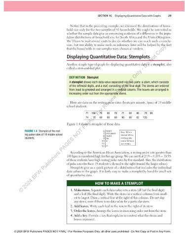
                                                   Figure 1.4 shows a stemplot of these data.

                      FIGURE 1.4  Stemplot of the rest-                     6 8889      Key:  8|2 is a
                      ing pulse rates of 19 middle school                   7 0114668   student whose
                                                                            8 2688
                      students.                                             9 06        resting pulse
                                                                           10 4         rate is 82 beats
                                                                           11           per minute.
                                                                           12 0
                                                     According to the American Heart Association, a resting pulse rate greater than
                                                   100 bpm is considered high for this age group. We can see that 2/19 = 0.105 = 10.5%
                                                   of these students have high resting pulse rates by this standard. Also, the distribution
                                                   of pulse rates for these 19 students is skewed to the right (toward the larger values).
                                                     Stemplots give us a quick picture of a distribution that includes the individual
                                                   data values in the graph. It is fairly easy to make a stemplot by hand for small sets
                                                   of quantitative data.

                                                                      HOW TO MAKE A STEMPLOT

                                                     1. Make stems. Separate each data value into a stem (all but the final digit)
                                                        and a leaf (the final digit). Write the stems in a vertical column from small-
                                                        est to largest. Draw a vertical line at the right of this column. Do not skip
                                                        any stems, even if there is no data value for a particular stem.
                                                     2. Add leaves. Write each leaf in the row to the right of its stem.
                                                     3. Order the leaves. Arrange the leaves in increasing order out from the stem.
                                                     4. Add a key. Provide a key that explains in context what the stems and
                                                        leaves represent.


               © 2024 BFW Publishers PAGES NOT FINAL - For Review Purposes Only, all other uses prohibited - Do Not Copy or Post in Any Form.


          02_StarnesTPS7e_40934_un01_p1_001_086_6pp.indd   29                                                          13/09/23   5:37 PM

