Page 50 - 2024-bfw-starnes-TPS7e-SE proofs.indd
P. 50
SecTIoN 1c  Displaying Quantitative Data with Graphs  37


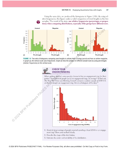
                                                     Using the same data, we produced the histograms in  Figure 1.9(b) . By using rel-
                                                   ative frequencies, this figure makes a valid comparison of word lengths in the two
                                                   samples. The moral of the story:   use relative frequencies (percentages or propor-
                                             caution
                                                   tions) when comparing distributions, especially if the groups have different sizes.

                   © 2024 BFW Publishers PAGES NOT FINAL - For Review Purposes Only - Do Not Copy
                                           Journal            Magazine                    Journal             Magazine
                                 90                                             30
                                 80
                                                                                25
                                 70                                             20
                               Frequency  50                                   Percent  15
                                 60
                                 40
                                 30                                             10
                                 20
                                                                                 5
                                 10
                                 0                                               0
                                    0  2  4  6  8  10 12 14 0  2  4  6  8  101214   0  2  4  6  8  10 12 14 0  2  4  6  8  101214
                              (a)        Word length         Word length      (b)        Word length         Word length

                                   FIGURE   1.9    Two sets of histograms comparing word lengths in articles from a biology journal and from an airline magazine.

                              In graph (a), the vertical scale uses frequencies. Graph (b) fixes the problem of different sample sizes by using percentages
                              (relative frequencies) on the vertical scale.

                                                                            CHECK YOUR
                                                              UNDERSTANDING


                                                       When getting married, some people choose to buy an engagement ring for their
                                                     partner. How much do people spend on engagement rings, on average? To find out,
                                                     The New York Times  and  Morning Consult  surveyed a random sample of 1640 U.S.
                                                     adults who bought an engagement ring. Here is a histogram of the data:    39


                                                                  250


                                                                  200

                                                                 Number of people  150


                                                                  100


                                                                   50


                                                                    0
                                                                     0    2    4    6    8   10   12   14  16
                                                                               Cost of engagement ring ($1000s)


                                                           1.   About what percentage of people reported spending at least $2000 on an engage-
                                                        ment ring? Show your method clearly.
                                                       2.  Describe the shape of the distribution.

                                                       3.   Estimate the center and variability of the distribution.


               © 2024 BFW Publishers PAGES NOT FINAL - For Review Purposes Only, all other uses prohibited - Do Not Copy or Post in Any Form.


          02_StarnesTPS7e_40934_un01_p1_001_086_6pp.indd   37                                                          13/09/23   5:37 PM

