Page 78 - 2024-bfw-starnes-TPS7e-SE proofs.indd
P. 78
SecTIoN 1D  Describing Quantitative Data with Numbers   65


                                                   unlike the mean and standard deviation. As we will explain in Section 1F, there is
                         AP® EXAM TIP
                                                   some justification for using the 2  × SD rule in the special case of roughly symmetric,
                         You may be asked to deter-  single-peaked, mound-shaped distributions called normal distributions.
                         mine whether a quantitative   It is important to identify outliers in a distribution for several reasons:
                         data set has any outliers. Be
                         prepared to state and use the   1. They might be inaccurate data values. Maybe someone recorded a value as
                   © 2024 BFW Publishers PAGES NOT FINAL - For Review Purposes Only - Do Not Copy
                         1.5 × IQR rule and the 2 × SD   10.1 instead of 101. Perhaps a measuring device broke down. Or maybe some-
                        rule for identifying outliers.  one gave a silly response, like the student in a class survey who claimed to
                                                     study 30,000 minutes per night! Try to correct errors like these if possible. If
                                                     you can’t, give summary statistics with and without the outlier.
                                                   2. They can indicate a remarkable occurrence. For example, in a graph of career
                                                     earnings of professional tennis players, Serena Williams is likely to be an outlier.
                                                   3. They can heavily influence the values of some summary statistics, such as
                                                     the mean, range, and standard deviation.

                                                   Displaying Summary Statistics: Boxplots


                                                   You can use a dotplot, stemplot, or histogram to display the distribution of a
                                                   quantitative variable. Another graphical option for quantitative data is a boxplot
                                                   (sometimes called a box-and-whisker plot). A boxplot summarizes a distribution
                                                   by displaying the location of five important values within the distribution, known
                                                   as its five-number summary.


                                                     DEFINITION  Five-number summary, Boxplot
                                                     The five-number summary of a distribution of quantitative data consists of the
                                                     minimum, the first quartile Q , the median, the third quartile Q , and the maximum.
                                                                            1
                                                                                                      3
                                                     A boxplot is a visual representation of the five-number summary.


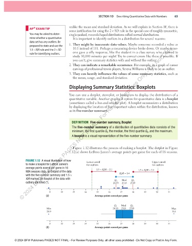
                                                     Figure 1.12 illustrates the process of making a boxplot. The dotplot in Figure
                                                   1.12(a) shows LeBron James’s average points per game for each of 16 seasons.


                      FIGURE 1.12  A visual illustration of how   Lower cutoff                            Upper cutoff
                      to make a boxplot for LeBron James’s    for outliers                                for outliers
                      average points scored per game in 16           1.5 × IQR = 2.1
                      NBA seasons data. (a) Dotplot of the data                                  1.5 × IQR = 2.1
                      with the five-number summary and 1.5 ×                        IQR = 1.4
                      IQR marked. (b) Boxplot of the data with                        Med   Q
                                                                                             3
                                                                                 Q 1
                      outliers identified (*).                                  26.55  27.15  27.95
                                                                        d             d
                                     d                                  d       d  d d  ddddd   d         d  d          d
                                     21      22      23      24      25      26      27      28     29      30      31
                                    (a)                             Average points scored per game


                                                                                 Q 1  Med  Q 3
                                    Min                                         26.55  27.15  27.95                    Max
                                    20.9                                                                               31.4
                                     *                                                                                  *


                                     21      22      23      24      25      26      27      28     29      30      31
                                    (b)                             Average points scored per game


               © 2024 BFW Publishers PAGES NOT FINAL - For Review Purposes Only, all other uses prohibited - Do Not Copy or Post in Any Form.


          02_StarnesTPS7e_40934_un01_p1_001_086_6pp.indd   65                                                          13/09/23   5:39 PM

