Page 24 - 2024-bfw-starnes-TPS7e-SE proofs.indd
P. 24
SecTIoN 1B  Displaying and Describing Categorical Data   11


                                                   common way to display categorical data is with a bar graph (also known as a bar
                                                   chart).


                                                     DEFINITION  Bar graph
                                                     A bar graph shows each category as a bar. The heights of the bars show the cate-
                   © 2024 BFW Publishers PAGES NOT FINAL - For Review Purposes Only - Do Not Copy
                                                     gory frequencies or relative frequencies.

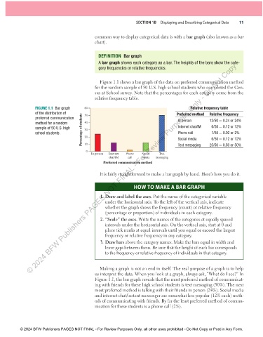
                                                     Figure 1.1 shows a bar graph of the data on preferred communication method
                                                   for the random sample of 50 U.S. high school students who completed the Cen-
                                                   sus at School survey. Note that the percentages for each category come from the
                                                   relative frequency table.

                      FIGURE 1.1  Bar graph   60                                                 Relative frequency table
                      of the distribution of   50                                         Preferred method  Relative frequency
                      preferred communication                                              In person      12/50 = 0.24 or 24%
                      method for a random     40
                      sample of 50 U.S. high   Percentage of students  30                  Internet chat/IM    6/50 = 0.12 or 12%
                      school students.        20                                           Phone call       1/50 = 0.02 or 2%
                                                                                                            6/50 = 0.12 or 12%
                                                                                           Social media
                                              10
                                               0                                           Text messaging  25/50 = 0.50 or 50%
                                                 In person  Internet  Phone  Social  Text
                                                          chat/IM  call   media  messaging
                                                       Preferred communication method

                                                     It is fairly straightforward to make a bar graph by hand. Here’s how you do it.


                                                                      HOW TO MAKE A BAR GRAPH

                                                     1. Draw and label the axes. Put the name of the categorical variable
                                                        under the horizontal axis. To the left of the vertical axis, indicate
                                                        whether the graph shows the frequency (count) or relative frequency
                                                        (percentage or proportion) of individuals in each category.
                                                     2. “Scale” the axes. Write the names of the categories at equally spaced
                                                        intervals under the horizontal axis. On the vertical axis, start at 0 and
                                                        place tick marks at equal intervals until you equal or exceed the largest
                                                        frequency or relative frequency in any category.
                                                     3. Draw bars above the category names. Make the bars equal in width and
                                                        leave gaps between them. Be sure that the height of each bar corresponds
                                                        to the frequency or relative frequency of individuals in that category.


                                                     Making a graph is not an end in itself. The real purpose of a graph is to help
                                                   us interpret the data. When you look at a graph, always ask, “What do I see?” In
                                                   Figure 1.1, the bar graph reveals that the most preferred method of communicat-
                                                   ing with friends for these high school students is text messaging (50%). The next
                                                   most preferred method is talking with their friends in person (24%). Social media
                                                   and internet chat/instant messenger are somewhat less popular (12% each) meth-
                                                   ods of communicating with friends. By far the least preferred method of commu-
                                                   nication for these students is a phone call (2%).


               © 2024 BFW Publishers PAGES NOT FINAL - For Review Purposes Only, all other uses prohibited - Do Not Copy or Post in Any Form.


          02_StarnesTPS7e_40934_un01_p1_001_086_6pp.indd   11                                                          13/09/23   5:36 PM

