Page 27 - 2024-bfw-starnes-TPS7e-SE proofs.indd
P. 27
14     UNIT 1  Exploring One-Variable Data


                 SOLUTION:
                 Tweens tend to report less daily screen time than teens. Tweens are more likely than teens to spend no time
                 (6% versus 3%), less than 2 hours (24% versus 7%), and from 2 to less than 4 hours (23% versus 15%) on
                 digital devices per day. Teens are more likely than tweens to spend from 4 to less than 8 hours (34% versus
                   © 2024 BFW Publishers PAGES NOT FINAL - For Review Purposes Only - Do Not Copy
                 27%) and 8 or more hours (41% versus 20%) on digital devices per day. More than half (53%) of tweens report
                 less than 4 hours of screen time per day, while 75% of teens report 4 or more hours per day of screen time.

                                                                                       FoR PRAcTIce, TRY eXeRcISe 7


                                              The following relative frequency table summarizes the data on daily screen
                                            time from the example by age group. As a result, the percentages in each row
                                            add to 100%. Note that we could have also compared the distributions with this
                                            relative frequency table.
                                                                           Daily time spent on digital devices
                                                                 None  < 2 hours  2 to < 4 hours  4 to < 8 hours  8+ hours
                                                         Teens   3%        7%       15%         34%       41%
                                               Age group
                                                         Tweens  6%      24%        23%         27%       20%

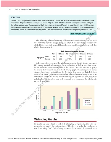
                                              In the example, we grouped the bars by age group in the side-by-side bar graph.
                                            This arrangement clearly shows the two distributions of daily screen time — one
                                            for the teens and one for the tweens in the sample. It is also possible to group
                                            the bars by daily screen time, as in the following graph. This arrangement makes
                                            category-by-category comparisons for the daily time spent on digital devices
                                              easier — but now it’s harder to see the individual distributions of daily screen time
                                            for the teens and for the tweens. Whichever way you organize the bars, be sure to
                                            include a key that describes what each color or type of shading on the side-by-side
                                            bar graph represents.

                                                 45
                                                 40
                                                 35
                                                 30
                                               Percent  25
                                                 20
                                                                                                      Age group
                                                 15
                                                                                                        Teens
                                                 10                                                     Tweens
                                                 5
                                                 0
                                                      None       <2      2 to <4  4 to <8    8+
                                                                    Daily screen time (h)

                                            Misleading Graphs


                                            Bar graphs can be a bit dull to look at. It is tempting to replace the bars with pic-
                                            tures or to use special three-dimensional (3D) effects to make the graphs seem
                                            more interesting. Don’t do it! Our eyes react to the area of the bars as well as to


               © 2024 BFW Publishers PAGES NOT FINAL - For Review Purposes Only, all other uses prohibited - Do Not Copy or Post in Any Form.


          02_StarnesTPS7e_40934_un01_p1_001_086_6pp.indd   14                                                          13/09/23   5:36 PM

