Page 29 - 2024-bfw-starnes-TPS7e-SE proofs.indd
P. 29
16     UNIT 1  Exploring One-Variable Data


                                                There are two important lessons to be learned from this example:   (1) beware
                                      caution
                                            the pictograph and (2) watch those scales.


                                                                CHECK YOUR
                   © 2024 BFW Publishers PAGES NOT FINAL - For Review Purposes Only - Do Not Copy
                                                      UNDERSTANDING
                                                The Pew Research Center asked a random sample of 1502 U.S. adults about their
                                              cell phone ownership. The frequency table summarizes their responses.    13

                                                                   Type of cell phone    Frequency
                                                                  None                      73
                                                                   Cell phone, not smartphone      212
                                                                  Smartphone              1217
                                                                   Total                   1502
                                                    1.   Make a relative frequency bar graph to display the distribution of cell phone

                                                ownership for the 1502 people in the sample. Describe what you see.
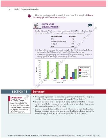
                                                2.  The following graph displays the distribution of cell phone ownership for each of

                                                four age groups in the sample. Compare the distributions.
                                                  100
                                                  90
                                                  80
                                                  70                                               Phone ownership
                                                  60
                                                 Percent  50                                         No cell phone
                                                  40
                                                  30                                                 Cell phone,
                                                                                                     not smartphone
                                                  20
                                                                                                     Smartphone
                                                  10
                                                   0
                                                         18–29      30–49      50–64      65+
                                                                        Age group


                        SECTION 1B          Summary


                                            •     A  bar graph  or pie chart can be used to display the distribution of a categorical
                     AP® EXAM TIP             variable. When examining any graph, ask yourself, “What do I see?”
                 AP® Daily Videos

                                            •   You can use a  side-by-side bar graph  to compare the distribution of one cat-
                   Review the content of this   egorical variable for two or more groups. Be sure to use relative frequencies
                 section and get extra help by   when comparing groups of different sizes.
                 watching the AP® Daily Videos

                 for Topic 1.4, which are avail-  •   Beware of graphs that mislead the eye. Look at the scales to see if they have been
                 able in AP® Classroom.       distorted to create a particular impression. Avoid making graphs that replace the
                                              bars of a bar graph with pictures whose height and width both change.


               © 2024 BFW Publishers PAGES NOT FINAL - For Review Purposes Only, all other uses prohibited - Do Not Copy or Post in Any Form.


          02_StarnesTPS7e_40934_un01_p1_001_086_6pp.indd   16                                                          13/09/23   5:37 PM

