Page 33 - 2024-bfw-starnes-TPS7e-SE proofs.indd
P. 33
20     UNIT 1  Exploring One-Variable Data


               (a)  Describe what this graph reveals about lottery    Multiple Choice   Select the best answer for each question.
                  ticket buying habits among the different education   18.  For which of the following would it be inappropriate to
                  groups.                                              display the data with a single pie chart?
               (b)  Would it be appropriate to make a pie chart for this   (A)  The distribution of car colors for vehicles pur-
                  data set? Explain your answer.                          chased in the last month
                   © 2024 BFW Publishers PAGES NOT FINAL - For Review Purposes Only - Do Not Copy
               For Investigation  Apply the skills from the section in a new    (B)  The distribution of unemployment percentages for
               context or nonroutine way.                                 each of the 50 states
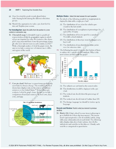
               16.  Choropleth maps A choropleth map is a graphical    (C) The distribution of favorite sport for a sample of
                  representation of data by geographic region in which    30 middle school students
                  values are depicted by color. For instance, the choro-  (D) The distribution of shoe type worn by shoppers at a
                  pleth map presented here shows the percentage of peo-   local mall
                                                             27
                  ple who were internet users in each country in 2020.
                  Write a thorough analysis of what the graph shows. Be   (E)  The distribution of presidential candidate prefer-
                  sure to include a comparison of internet use in differ-  ence for voters in a state
                  ent regions of the world.                        19.  The following bar graph shows the distribution of favor-
                                                                       ite subject for a sample of 1000 students. What is the
                                                                       most serious problem with the graph?

                                                                           280
                                                                           260
                                                                          Number of students  220
                                                                           240
                                                                           200
                                                                           180
                                                                           160
                                                                           140
                                  Internet use share (%)                   120
                                  0–20  40–60  80–100                      100
                                  20–40  60–80  n.a.                            Math  Science English Social  Foreign  Fine
                                                                                                 studies  language arts
                                                                                          Favorite subject
               17.  Cow pie chart? Methane is a greenhouse gas that may
                  contribute to climate change. The modified pie chart   (A)  The subjects are not listed in the correct order.
                  shown here displays data on the sources of methane   (B)  This distribution should be displayed with a pie
                                           28
                  emissions in the United States.  Write a thorough       chart.
                  analysis of what the graph shows. Be sure to include a
                  comparison of methane emissions by beef cows, dairy   (C) The vertical axis should show the percentage of
                  cows, and pigs.                                         students.
                                                                       (D) The vertical axis should start at 0 rather than 100.

                              The U.S. methane breakdown               (E)  The foreign language bar should be broken up by
                                                                          language.
                                        back end         front end
               Coal mining  Others  20%      2.6% BEEF  97.4%      Recycle and Review Practice what you learned in previous
                  8%      10%                                      sections.
                               Livestock                           20.  Hotels (1A) A high school lacrosse team is planning to
                               production                              go to Buffalo for a three-day tournament. The tourna-
                     Land lls    35%    11%  43% DAIRY  57%            ment’s sponsor provides a list of available hotels, along
                       17%
                                                                       with some information about each hotel. The following
                          Oil and gas                                  table displays data about hotel options. Identify the
                          production   4%    89% PORK  11%
                             30%                                       individuals and variables in this data set. Classify each
                                                                       variable as categorical or quantitative.


               © 2024 BFW Publishers PAGES NOT FINAL - For Review Purposes Only, all other uses prohibited - Do Not Copy or Post in Any Form.


          02_StarnesTPS7e_40934_un01_p1_001_086_6pp.indd   20                                                          13/09/23   5:37 PM

