Page 36 - 2024-bfw-starnes-TPS7e-SE proofs.indd
P. 36
SecTIoN 1c  Displaying Quantitative Data with Graphs  23


                                                                             HOW TO MAKE A DOTPLOT

                                                           1.    Draw and label the axis.  Draw a horizontal axis and put the name of
                                                        the quantitative variable underneath it. Be sure to include units of mea-
                                                        surement if appropriate.
                   © 2024 BFW Publishers PAGES NOT FINAL - For Review Purposes Only - Do Not Copy
                                                       2.    Scale the axis.  Find the smallest and largest values in the data set. Start
                                                        the horizontal axis at a convenient number equal to or less than the
                                                        smallest value and place tick marks at equal intervals until you equal or
                                                        exceed the largest value.
                                                       3.    Plot the values.  Mark a dot above the location on the horizontal axis
                                                        corresponding to each data value. Try to make all the dots the same size
                                                        and space them out equally as you stack them.


                                                       Remember what we said in Section 1B: making a graph is not an end in itself.
                                                   When you look at a graph, always ask, “What do I see?” The dotplot in  Figure
                                                   1.2 shows that 8/71   = 0.113   = 11.3% of the Flint water samples had lead levels


                                                   that exceeded 15 parts per billion. Does that mean Flint’s water system required
                                                   action based on the EPA guideline? We’ll answer that question — and tell you the
                                                   rest of the story about the Flint water crisis — in Section 1E.
                               EXAMPLE             eating healthy                                                 Skills 2.A, 2.B
                                                   Displaying quantitative data: Dotplots


                              PROBLEM:   How healthy is plant-based yogurt? The  Nutrition


                        Action Healthletter  provided   data on calories, saturated fat, protein,
                        calcium, and total sugars for many popular brands of yogurt. Here
                        are the data on the amount of added sugar, in teaspoons (tsp), in
                        single-serving containers for all of the plant-based yogurt brands:    30

                           0.0    1.0    1.0    2.5    0.0    0.0    1.0    1.5    2.0    2.0    3.0    3.5    2.5        Clare Gainey/Alamy Stock Photo
                           3.0    5.0    3.0    3.5    3.5    3.5    2.0    4.0    3.5    2.0    3.5    1.5    2.0
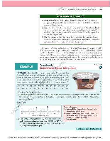
                              (a)   Make a dotplot of these data.
                            (b)  The American Heart Association (AHA) recommends a maximum of 6 teaspoons of added sugar per day

                                        31
                           for women.    What percentage of these plant-based yogurt brands have less than half of the AHA’s daily
                           recommendation?
                              SOLUTION:
                            (a)
                                                                                 To make the dotplot:
                                                                               1.  Draw and label the axis.  Be sure to include units
                                                                                  along with the variable name.

                              0.0  0.5  1.0  1.5  2.0  2.5  3.0  3.5  4.0  4.5  5.0    2.  Scale the axis. The smallest value is 0.0 and the
                                          Amount of added sugar (tsp)             largest value is 5.0. So we choose a scale from 0
                                                                                  to 5 with tick marks 0.5 unit apart.


                        ( b)   Half of the AHA’s recommended daily maximum would     3.  Plot the values.


                            be 3 teaspoons of added sugar, and 15/26   =   0.577   =
                            57.7% of these plant-based yogurt brands have less than
                            3 teaspoons of added sugar.
                                                                                                FoR PRAcTIce, TRY eXeRcISe 3


               © 2024 BFW Publishers PAGES NOT FINAL - For Review Purposes Only, all other uses prohibited - Do Not Copy or Post in Any Form.


          02_StarnesTPS7e_40934_un01_p1_001_086_6pp.indd   23                                                          13/09/23   5:37 PM

