Page 60 - 2024-bfw-starnes-TPS7e-SE proofs.indd
P. 60
SecTIoN 1c  Exercises   47


                          Which of the following statements about the dotplot is
                          not correct?

                          (A)  The center (median) of the distribution is        Interviewer 1
                             $8000.
                          (B)  There are more North Carolina colleges and uni-
                   © 2024 BFW Publishers PAGES NOT FINAL - For Review Purposes Only - Do Not Copy
                             versities with tuitions less than $10,000 than with
                             tuitions greater than $10,000.                      Interviewer 2
                          (C)  The tuitions vary from about $4000 to about
                             $54,000.                                             0       10     20     30     40     50
                                                                                            Workout time per week (h)
                          (D) There are two obvious outliers — institutions with
                             tuitions greater than $50,000.
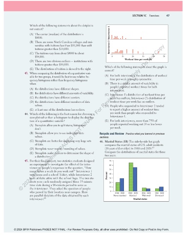
                          (E)  The distribution of tuition is skewed to the right.     Which of the following statements about the graph is
                                                                              correct?
                      43.  When comparing the distribution of a quantitative vari-
                          able for two groups, it would be best to use relative fre-  (A)  For both interviewers, the distribution of workout
                          quency histograms rather than frequency histograms     time per week is roughly symmetric.
                          when                                                (B)  There is a similar amount of variability in
                                                                                 people’s reported workout times for both
                          (A)  the distributions have different shapes.          interviewers.
                          (B)  the distributions have different amounts of variability.  (C) Interviewer 1’s distribution of workout time per
                          (C) the distributions have different centers.          week has outliers; Interviewer 2’s distribution of
                          (D) the distributions have different numbers of data   workout time per week has no outliers.
                             values.                                          (D) People who responded to Interviewer 2 tended
                          (E)  at least one of the distributions has outliers.   to report a higher amount of workout time
                      44.  Which of the following is the best reason for choosing a   per week than people who responded to
                          stemplot rather than a histogram to display the distribu-  Interviewer 1.
                          tion of a quantitative variable?                    (E)  For both interviewers, more than 75% of
                          (A)  Stemplots allow you to split stems; histograms    people reported working out 10 or less hours
                             don’t.                                              per week.
                          (B)  Stemplots allow you to see individual data    Recycle and Review   Practice what you learned in previous
                             values.                                      sections.
                          (C) Stemplots are better for displaying very large sets    46.  Marital Status (1B) The side-by-side bar graph
                             of data.                                         compares the marital status of U.S. adult residents
                                                                                                               63
                          (D) Stemplots never require rounding of values.     (18 years old or older) in 1980 and 2020.
                          (E)  Stemplots make it easier to determine the shape of   Compare the distributions of marital status for these
                             a distribution.                                  two years.
                      45.  For their final project, two statistics students designed   70
                          an experiment to investigate the effect of the inter-  60
                          viewer on people’s responses to the question, “How
                          many hours a week do you work out?” Interviewer 1      50
                          wore jeans and a school T-shirt, while Interviewer 2   Percent  40
                          wore athletic attire with the school logo. The two stu-  30
                          dents were each randomly assigned three 15-minute      20
                          time slots during a 90-minute period to serve as
                          the interviewer. They asked the question of people     10
                          who passed by their location near campus. Here          0  1980 2020  1980 2020  1980 2020  1980 2020
                          are parallel dotplots of the data obtained by each        Never married  Married  Widowed  Divorced
                          interviewer: 62                                                         Marital status


               © 2024 BFW Publishers PAGES NOT FINAL - For Review Purposes Only, all other uses prohibited - Do Not Copy or Post in Any Form.


          02_StarnesTPS7e_40934_un01_p1_001_086_6pp.indd   47                                                          13/09/23   5:38 PM

